SPACE JAM 2: A NEW LEGACY POSTERS
Designed for the Warner Brothers Corporation
These poster designs were developed for the film Space Jam 2. I submitted them to Warner Brothers for approval but the designs were never utilized, yet I was very proud to develop them and sharpen my poster designing skills. I was inspired by the original film, yet I wanted to remain true to the new version by keeping the same colors and new jersey design.
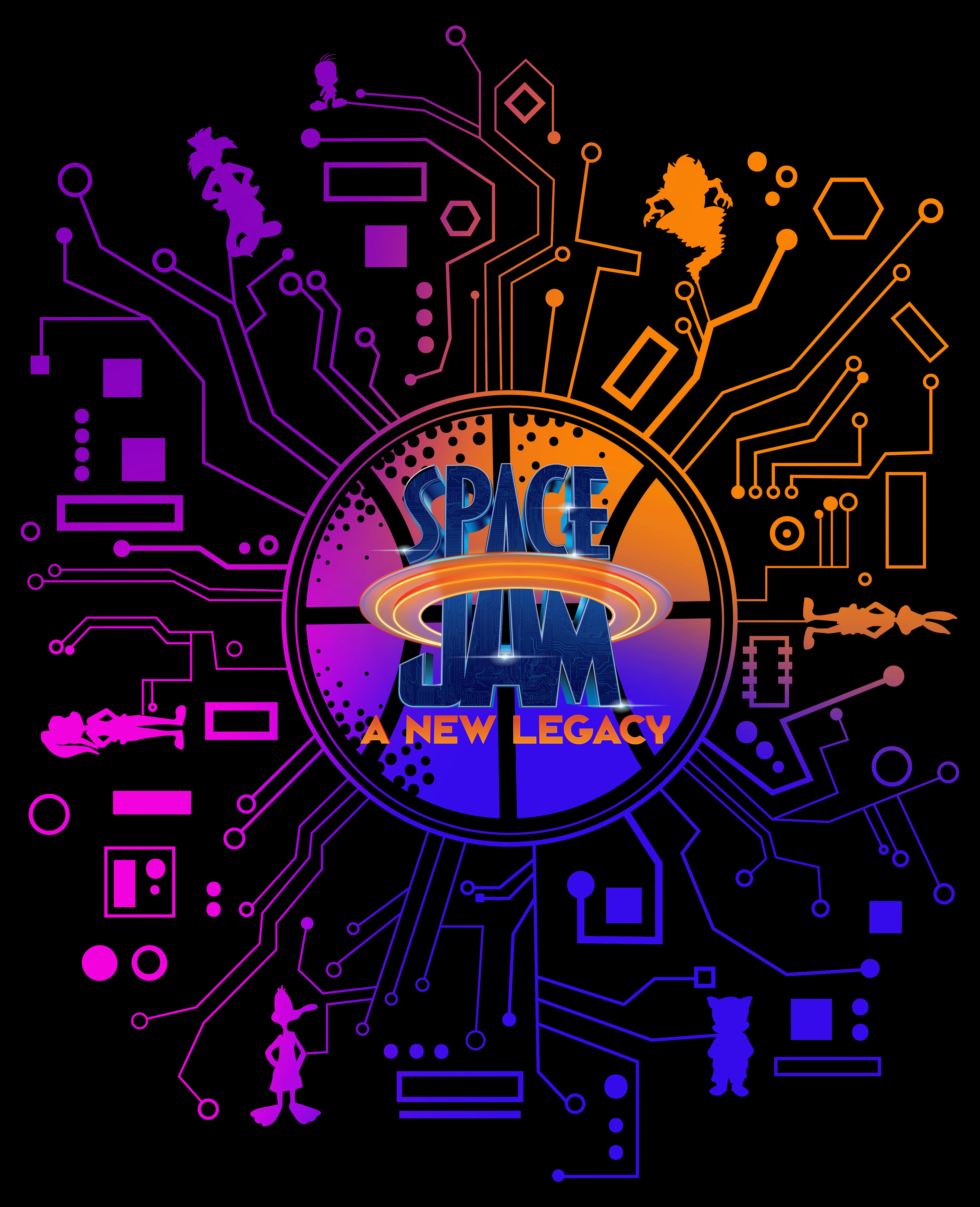
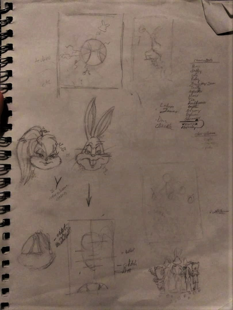
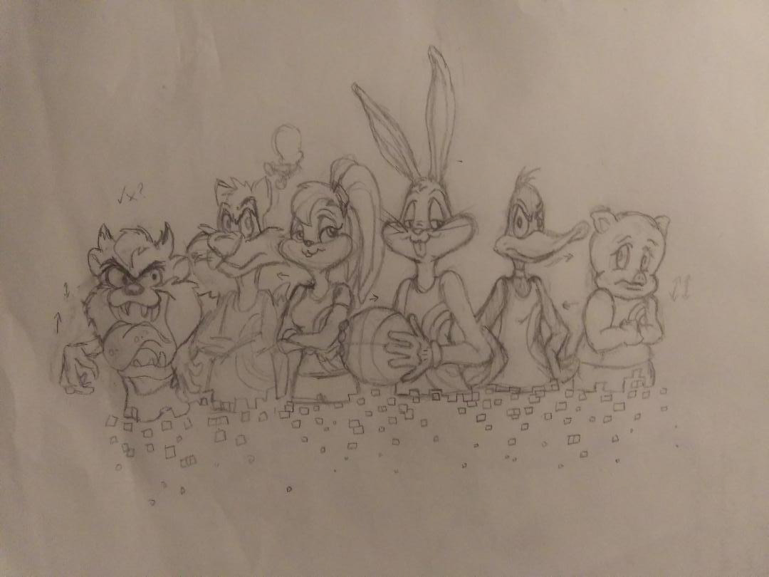
Bugs In The System - For this design I really wanted to reflect the digitalization of the film in both the films computer-like world setting, as well as the new animation style. I started with choosing which characters I wanted to highlight (taking into consideration the boundaries of the brief as well) and picked characters that would be easily recognizable among the complexity of the design. I made the focal point of the piece the basketball to highlight the theme of the film as well as to draw attention back to the logo of the film as provided in the brief. It also connects all the Looney Tunes characters together as it does in the film. For the color palette I stayed true to the colors that seemed themed throughout the reference posters as well as the new uniforms displayed in the trailer. Taking this all into consideration I came up with initial sketches which led to the finalized digital poster design.
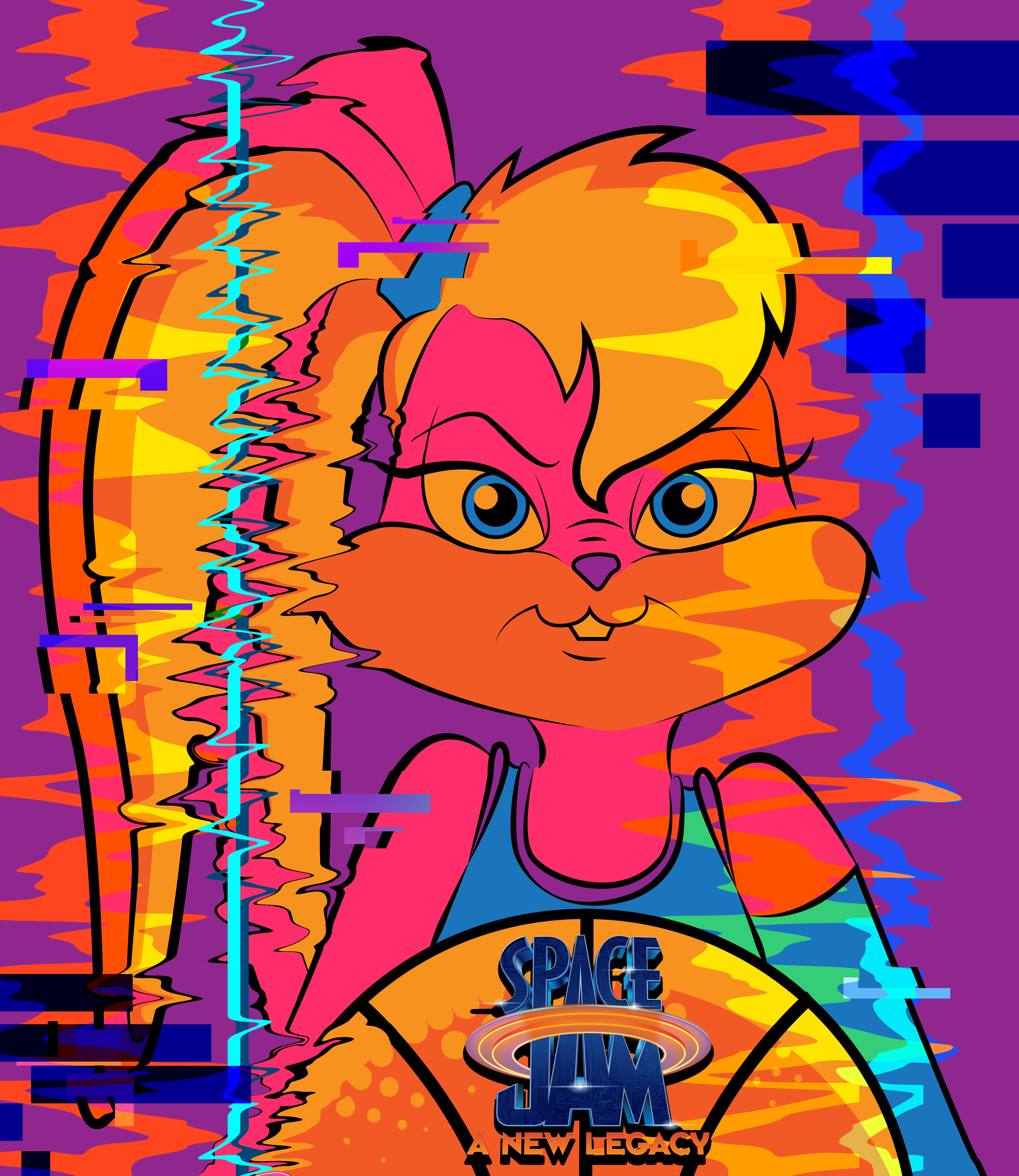
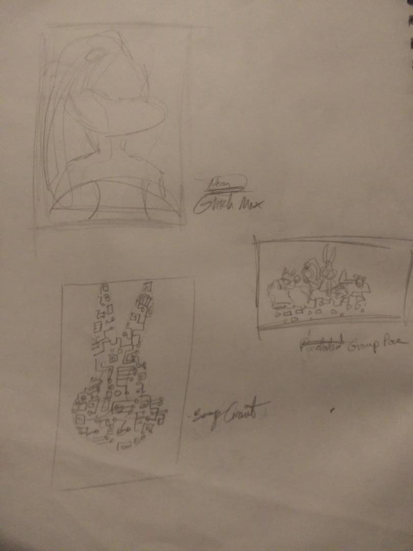
Playmaker - I wanted to showcase the digital take that the new film has by doing a glitch stylized poster. I first decided on once again choosing colors from the reference material to make a neon color palette to work with. Early on I chose Lola for this design to help viewers know at first glance that this is Space Jam (Since Lola originated in the first film). I also wanted to show her center stage rather than sidelined with the other characters because she is a strong character that can make it on her own. I am very delighted with how the design turned out and am overjoyed to see my vision realized in the end.
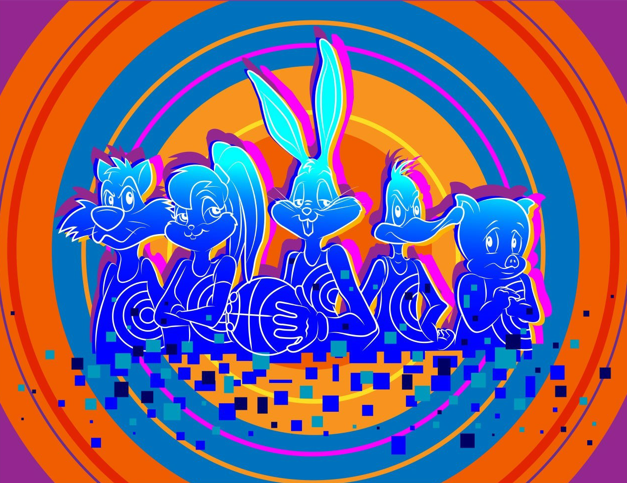
Tune Squad Pixelation - I really wanted to highlight the colors from the new uniforms in the film as well as the character posters provided. I also wanted to bring in the digital element shown in the trailer by having the characters pixelate as if they were digital. I did a rippling affect in the back to mimic the pattern on the new uniforms but to also mimic the Looney Tune target that usually open and ends each cartoon.
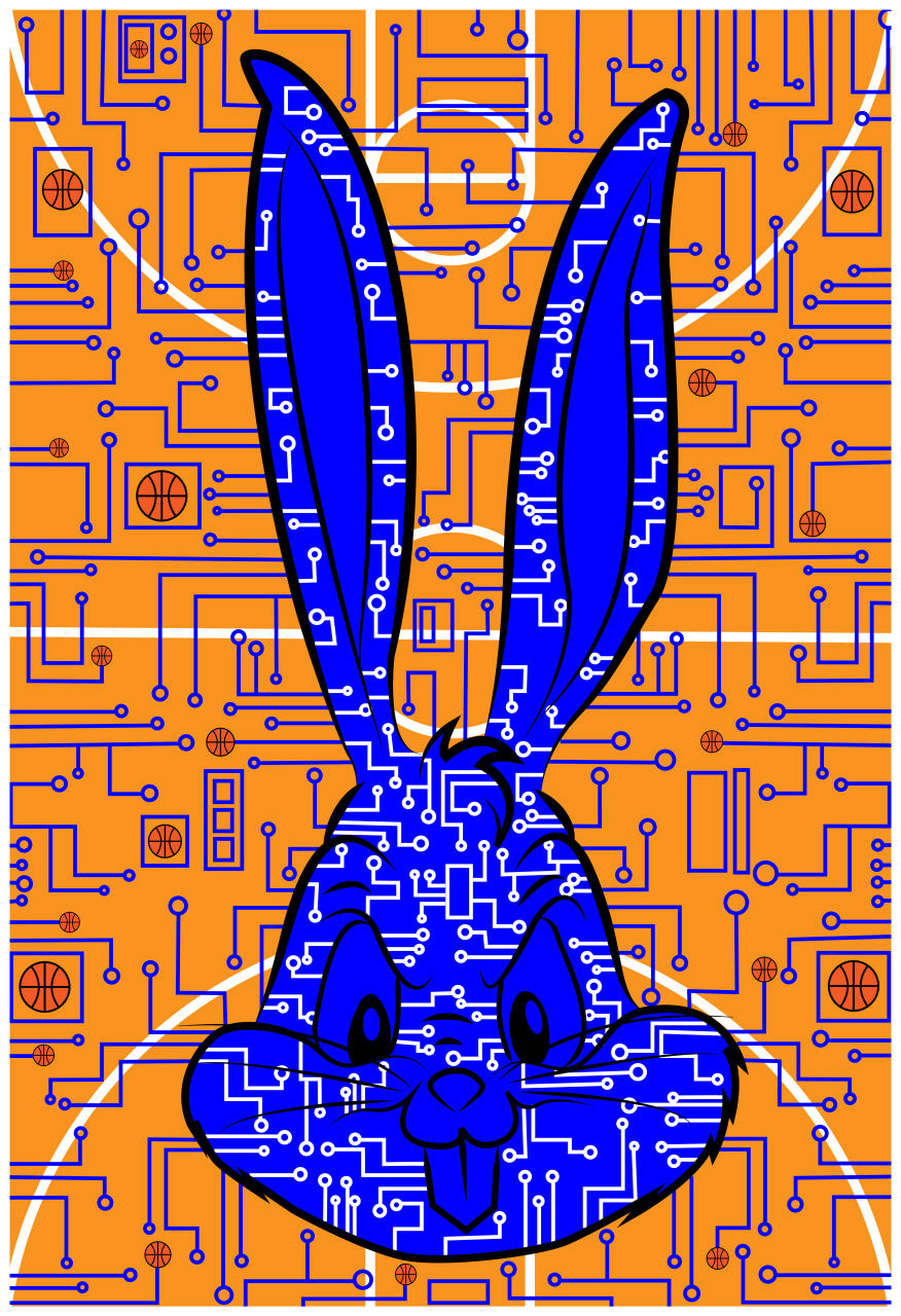
Basketball Bunny - I wanted to keep with the theme of Space Jam mixed with a digital style to match the movie's new look. I used Bugs Bunny because he is the most recognizable of the Looney Tunes to viewers. I wanted to create this circuit-like pattern and circulate it through the design to go along with the digital theme mentioned earlier. I still wanted to drive the basketball premise by doing the background as a basketball court. I felt to further the idea I would use actual depictions of basketballs throughout the circuit work to merge the two ideas I was going for. In deciding colors I wanted to keep it simple and used mostly oranges to tie back to basketball. I went with the addition of blue to match the main colors of the Tune Squad uniforms and to act as a complimentary color to the orange.
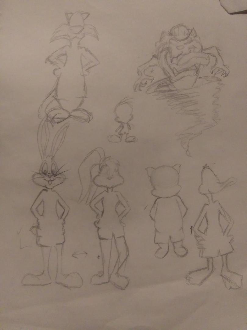
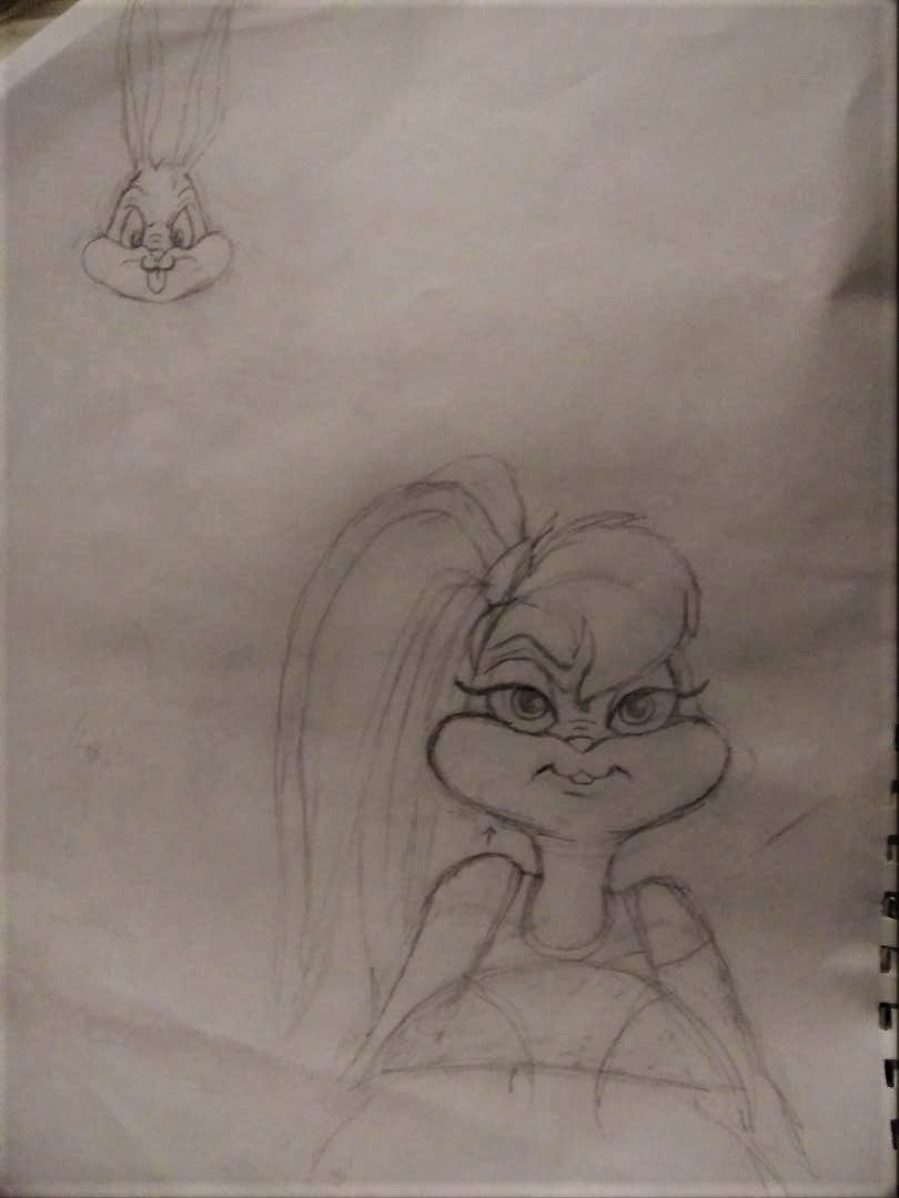
Sketches: