DC FANDOME
Designed for Warner Brothers
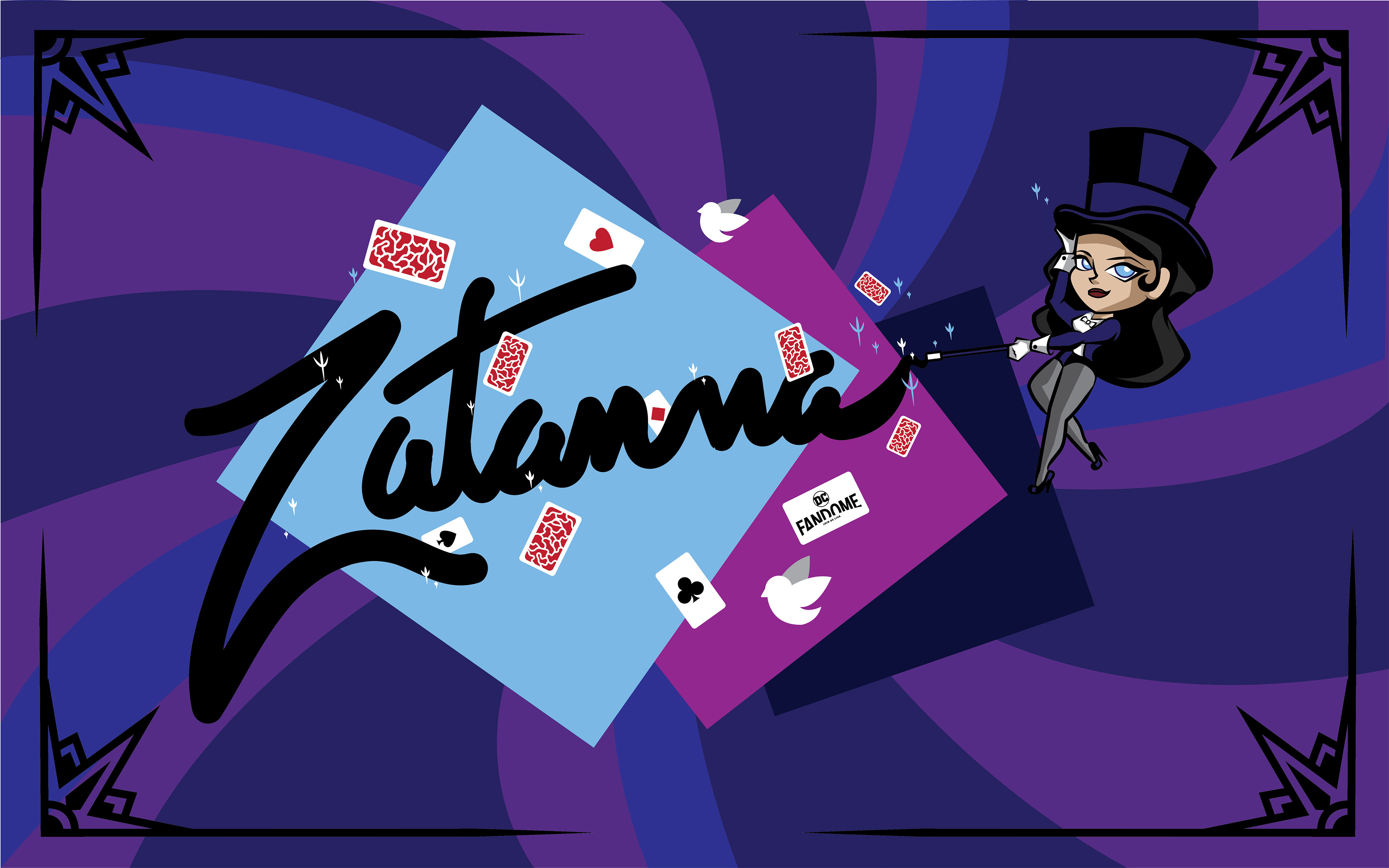
These were a few designs I developed for the DC Fandom event held once every year. These designs were submitted for the last two events which were held in both 2020 and 2021. The prompt was simply to make artwork based off a DC character. I chose a few characters I really like such as Flash, The Question, Batman (Terry McGinnis), Black Canary, Zatanna, The Riddler, and Raven.
2020
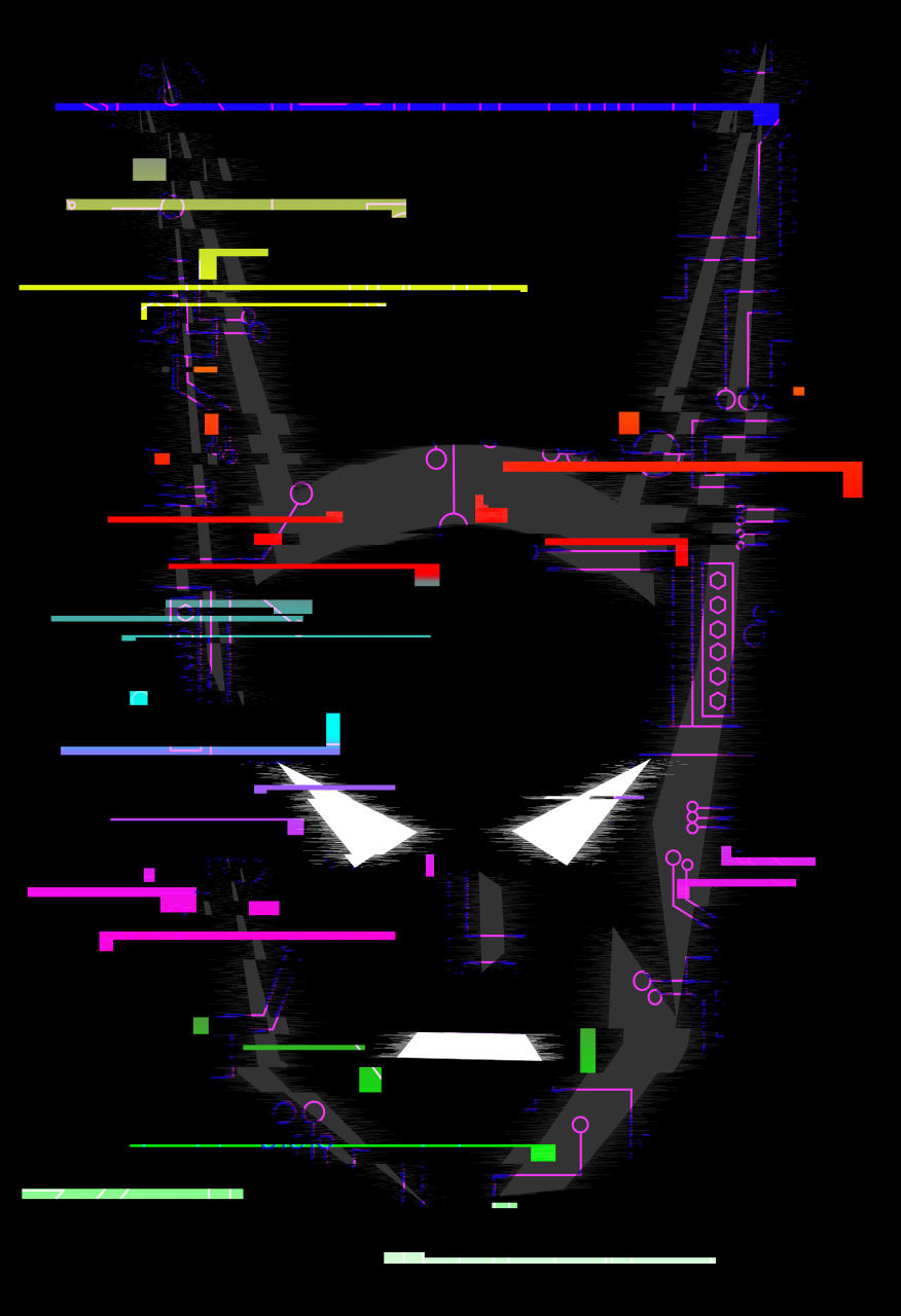
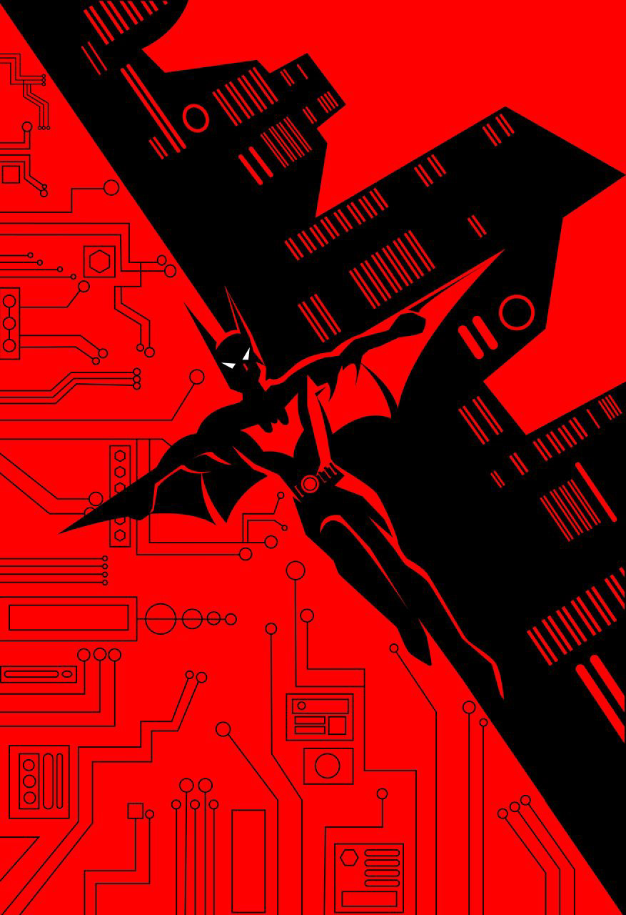
Cyber Punk - This design I fully embraced the cyberpunk style. I wanted to do something that seemed to capture the future technology of the show and film by doing a glitched effect on the face. I then overlaid in some tech patterns to pull the design together and further give it that glitched screen-like quality. I made sure that there was some pixelation and motion blurs on the face to again emphasize the cyber look. I wanted to remain simple, but really drive at the style of the show and film.
Beyond - I wanted to pay tribute to one of my favorite shows and version of Batman by creating a Batman Beyond fanart piece. For inspiration, I was instantly drawn to the cyber punk style of the Batman Beyond show and Return of the Joker film. I looked at much of the art from the show, as well as cyber punk art in general, to get an idea of what I wanted. As I began, I knew that I wanted to mimic the art style that is depicted in promotional material for the show while staying true to my own style. I tried to keep things minimal but also dynamic to really stay true to the show and its original art style.
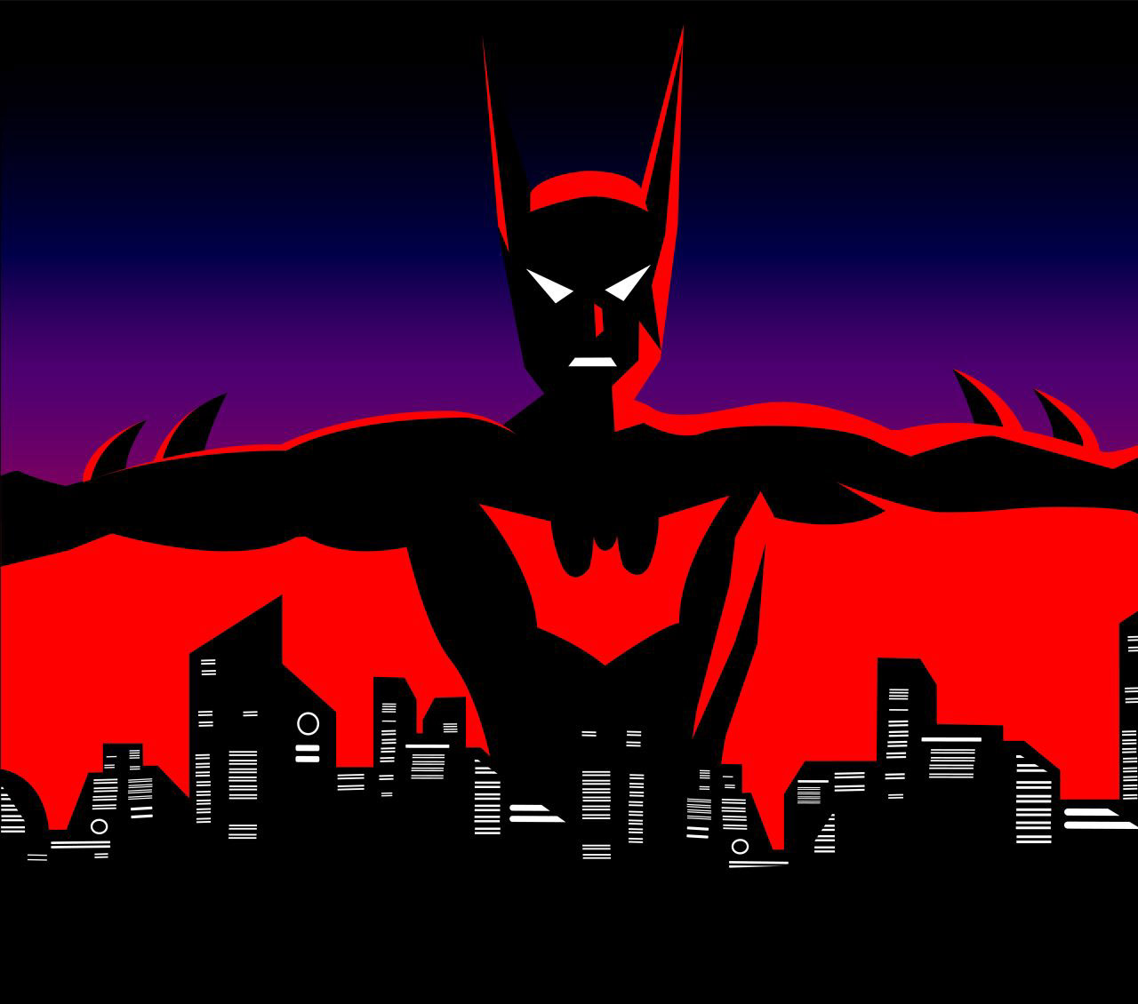
This Is My City - This idea that sprouted from my original Batman submission entitled, ‘Beyond.’ This time, I used the wings to encapsulate the city to show that Batman owns and watches the city for protection. I used similar elements from my original design but changed them up to instead make a horizontal cityscape design rather than diagonally like before. I wanted it to be simple but embody Batman, all the while looking like something that could really be in a comic adaptation.
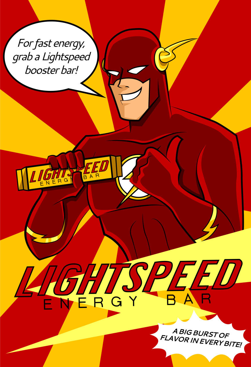
Lightspeed - I based this piece after my favorite DC character The Flash from the animated Justice League television show. In one of the episodes, Flash appears in a commercial for Lightspeed Energy Bars. Throughout the show, the energy bar makes several appearances but it’s the commercial that stood out to me. I thought that it would be fun to create a fake fan art advertisement poster of Flash endorsing the energy bar. I looked to the animated Justice League show as reference and copied the exact same type for the logo of the energy bar. I also used his dialogue from the episode for the speech bubble and the small print under the title near the bottom.
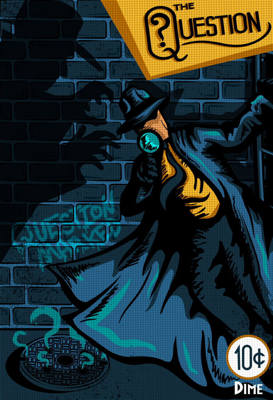
Question Marked - I wanted to make a design that looked like a classic dime store detective novel since The Question is a noir-type character. I looked to other novel covers as reference (and, of course, past Question comic covers as well). I wanted to mimic all those past covers, which were able to tell a story with a simple image. I began with a few sketches to land on this one which depicts The Question looking for clues, unaware that, all this time, the villain is creeping up behind him. The title goes along with the narrative by showing The Question is a marked man as the villain pursues him.
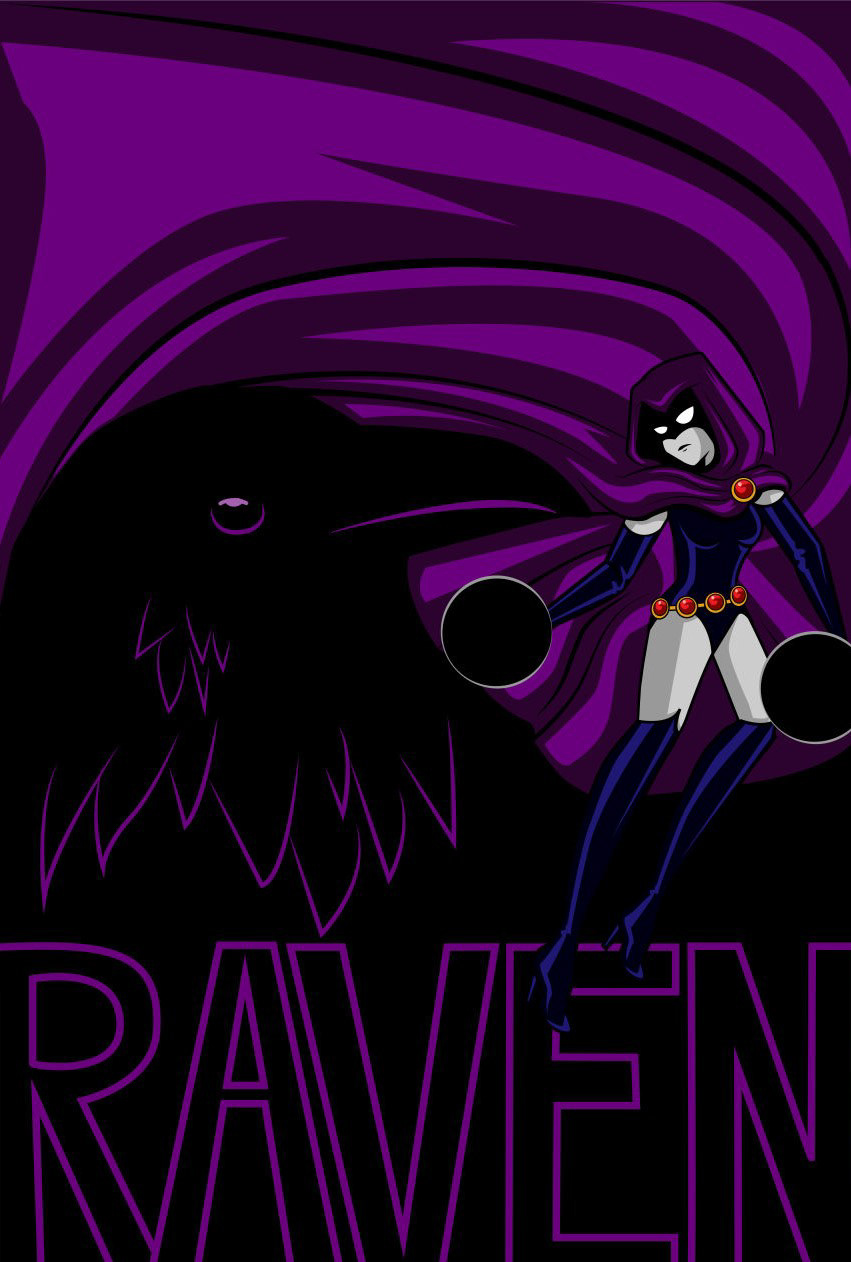
Azarath Metrion Zinthos - When deciding to use Raven, I wanted to incorporate different elements from several well-known version of the character. The purple color of the cape is from the Teen Titans Go! version of Raven, while the outfit is a mixture of the original Teen Titans television series with a hint of her comic book depictions. I knew immediately that I wanted to play around with negative space and began playing around with the idea of Raven’s cape revealing a real raven among its folds. I tipped her into a sort of yin yang type position between her and the raven to show that she is one with her powers and inner self. I put her name below as a sort of homage to the Teen Titans title type (though the type is my own design and not a real typeface).
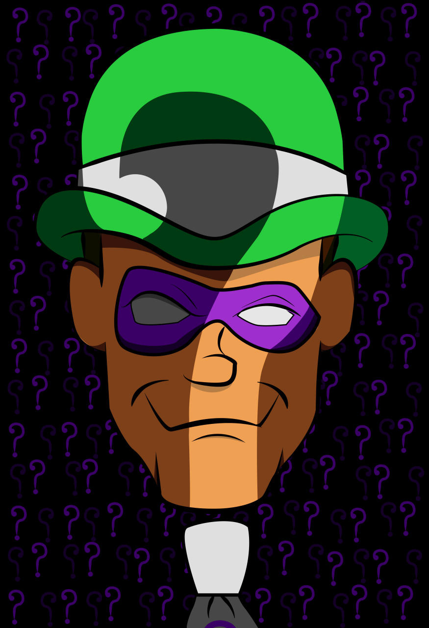
Riddle Me This - For this design, I looked to the original design of the Batman: The Animated Series Riddler. I wanted to emphasize the question mark for which The Riddler is known for. I originally wanted to do something that only showed part of the face, but I decided in the end to have the question mark be a kind of light shining onto the face instead. I wanted to subtly incorporate it onto his person rather than just having it out in the open. I then reemphasized the question mark in a pattern behind him to provide some kind of grounding to the face rather than having it float around. I kept a consistent color scheme to tie the whole thing together and make it stand out while also being simple.
2021
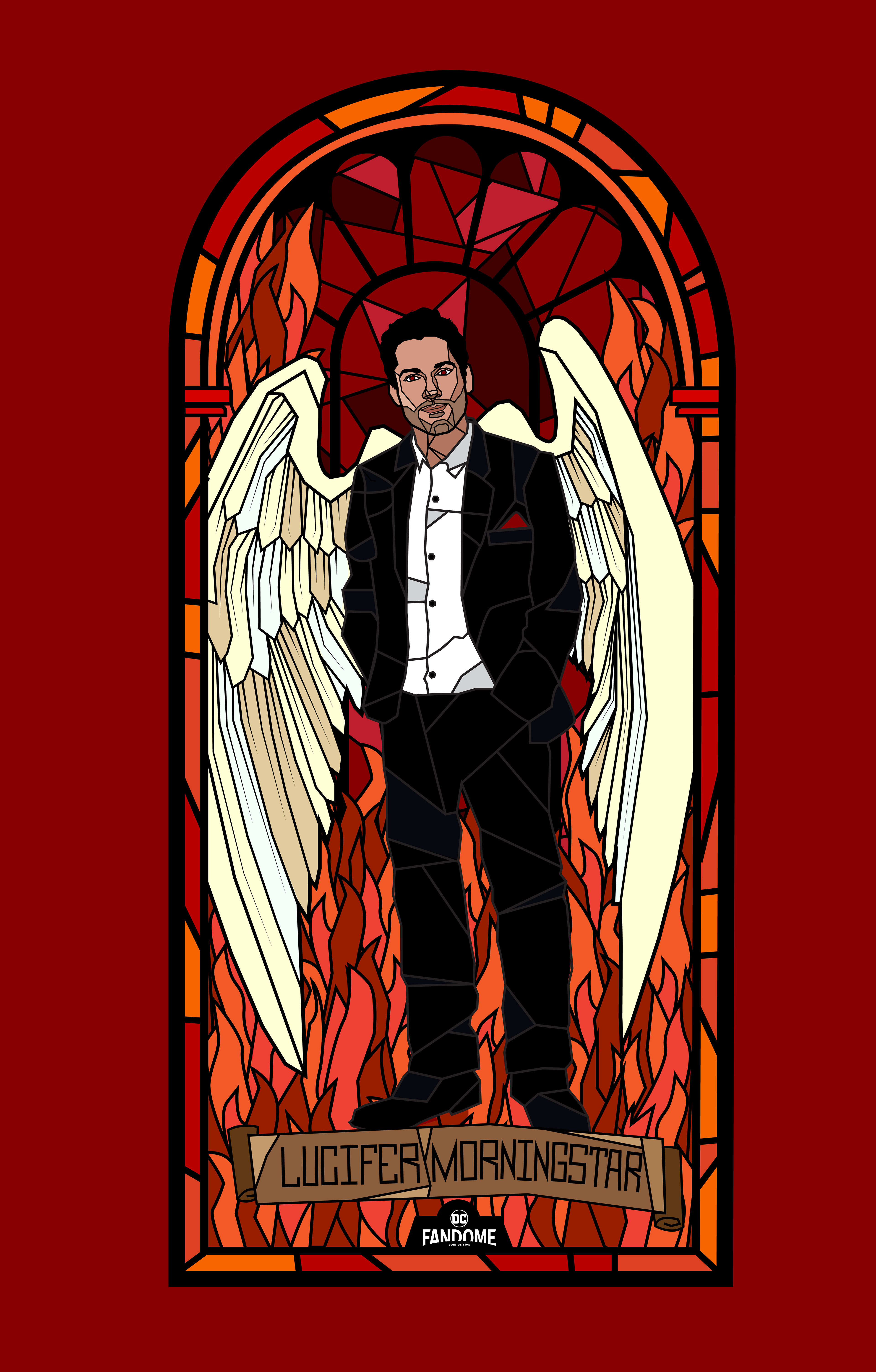
Hell Yeah - I wanted to highlight the television show Lucifer with this image since it will be having it's final season this year. I tried staying true to the style of the show by going with a usual ensemble of reds and blacks. The illustrative stained glass approach was to tie back to the essence of the character and his background.
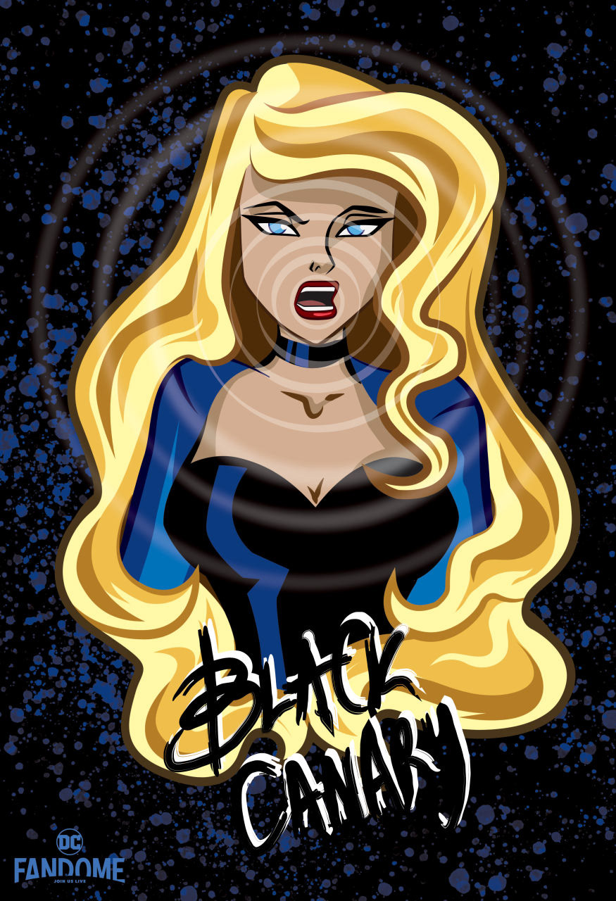
Battle Cry - I had always wanted to do a design based around Black Canary. I also knew I wanted to use her animated Justice League form. As I started my initial sketches, I tried to make everything resemble a music poster so as to tie back to the character of Black Canary. In the end I decided to go with a hard rock, grunge-like style which I felt worked well together with the character's image I had developed.
annataZ - I wanted to change from my usual style and do something more loose and cartoon-like. I started with Zatanna's character and went off from there using inspiration from old magic posters to create the boarder and background. I wanted to create something that seemed magical and whimsical to fit the character.
Back to Top