Martinis, girls, and guns​​​​​​​
Designed for MGM Studios
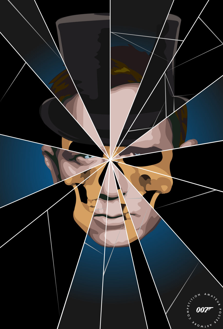
This James Bond design was created for MGM Studios and the new Bond film No Time to Die. Through Talenthouse, MGM sent out the call for designers to create a Daniel Craig James Bond poster inspired by not only the many previous Bond films but, most importantly, the current film (originally set to be released in May). A mood board was provided by the studio which inspired this design. The mood board contained many classic film posters from James Bond, including one from the Sean Connery film Dr. No. I chose to use the iconic dots from the opening theme for my design as well as the colors to create a vibrant poster. I displayed Daniel Craig’s Bond prominently in the center to tie the themes all together. I the decided to add elements that James Bond is known for and which the poster became titled: Martinis, Girls, and Guns. In select circles around him are both his signature martini and an Aston Martin car. I also could not resist using the dots as a way to incorporate the 007 number within. My intention was to make it scream James Bond and class, all the while retaining my illustrative style. Finally, I put the logo at the bottom, which was required by the studio, and submitted it, along with several other designs, to Talenthouse. I was happy to receive word that this design was chosen as a finalist and will be utilized for MGM Studios in the future when the new film is released (This November).
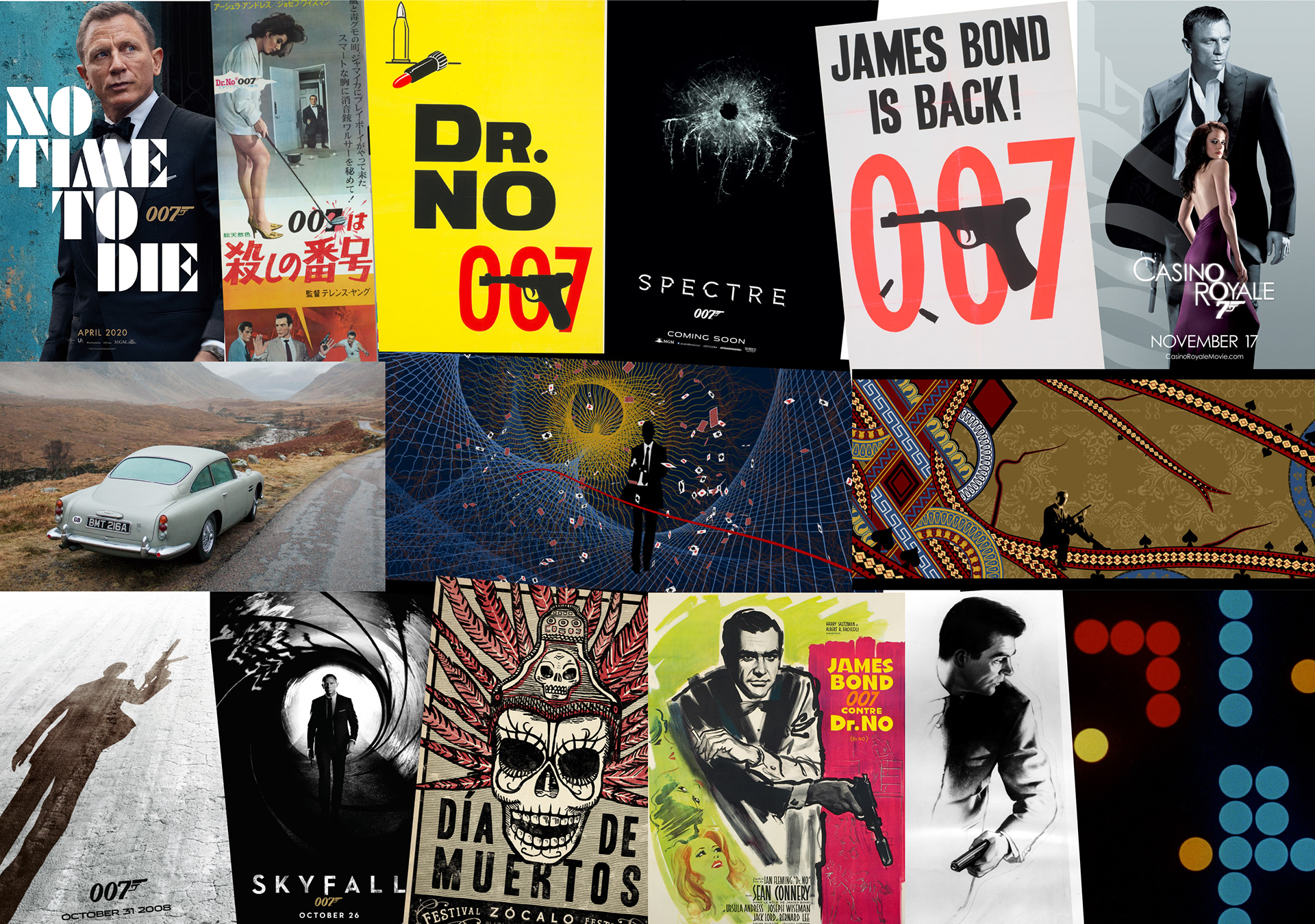
Mood Board:
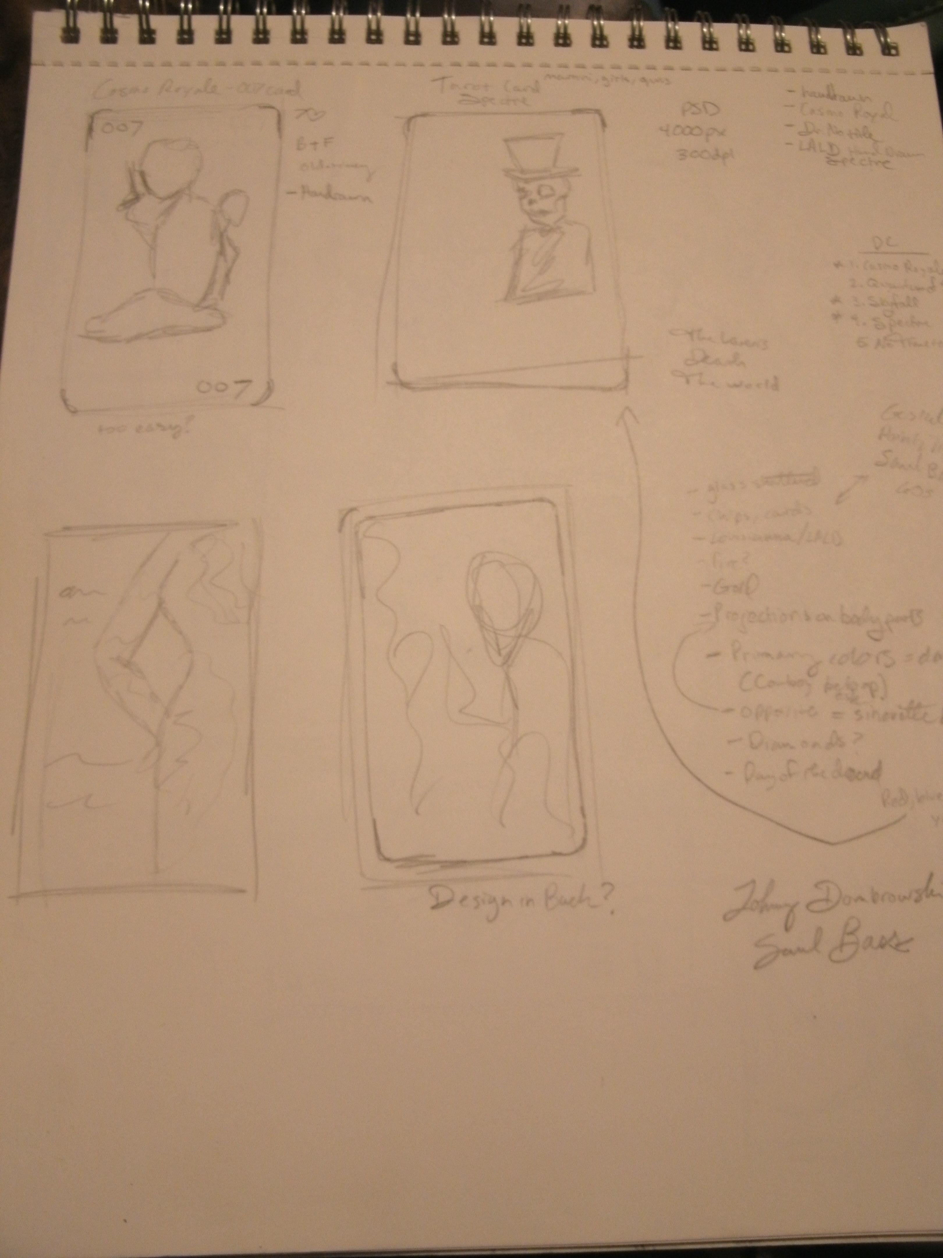
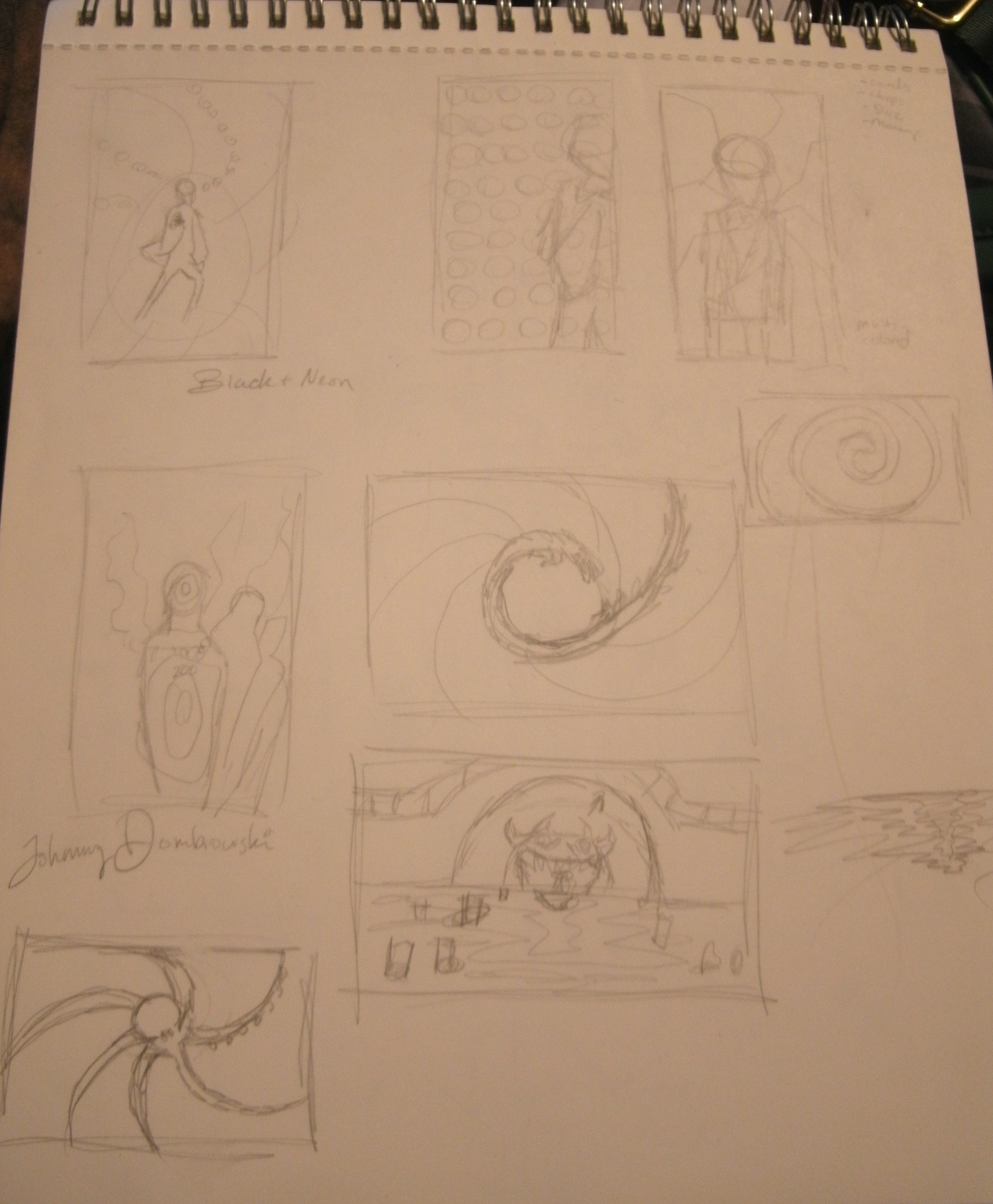
Sketches/Reference Material:
Other Submissions:
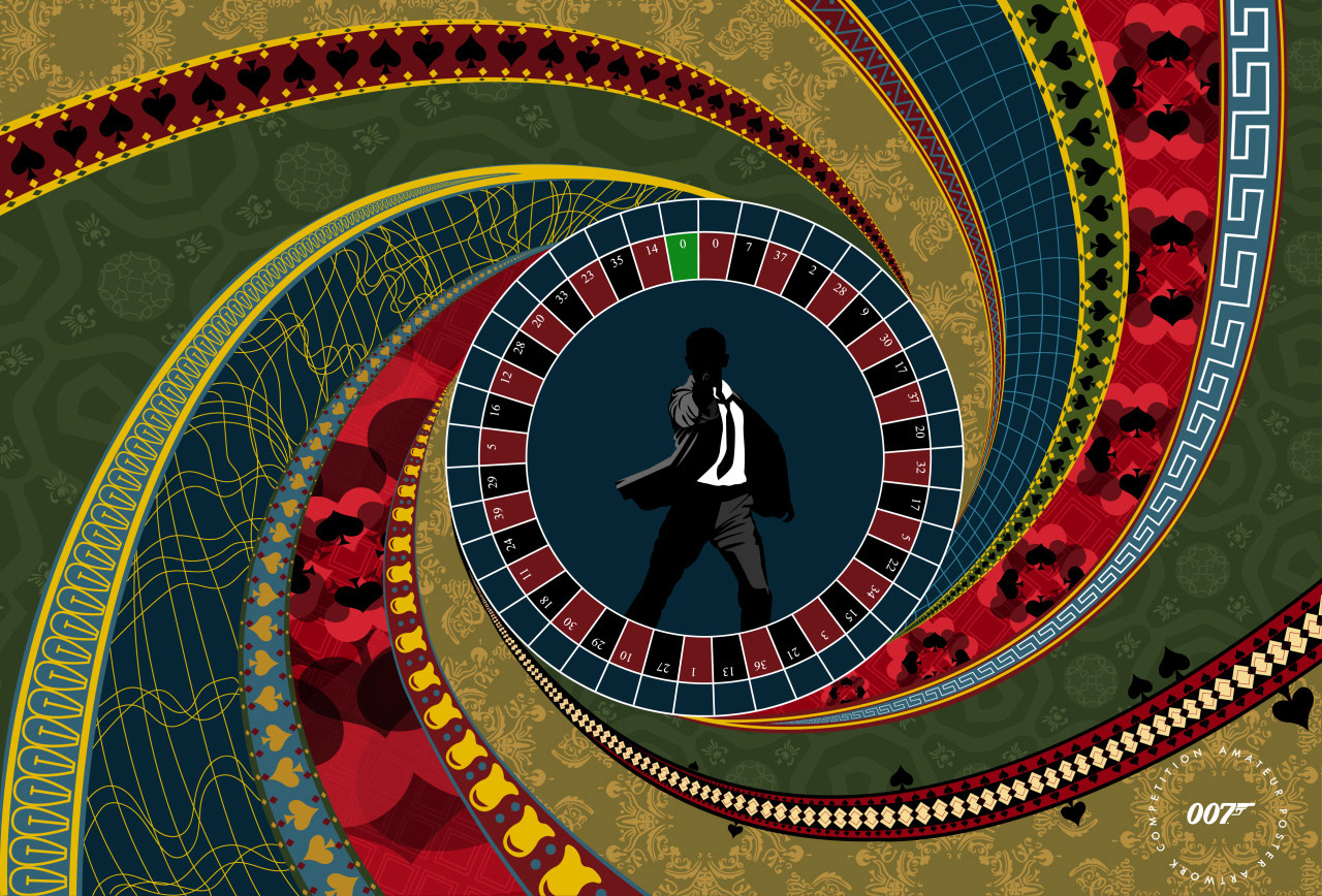
At the End of the Barrel - This design was inspired by the title sequence of the Daniel Craig film Casino Royale. I used the reference from the film and mood board to complete the patterns. I wanted to show the beautiful imagery from the montage and tie it back to the classic James Bond gun barrel which is shown in every film. I also used the style of the film to depict Daniel Craig’s silhouette in the center taking his shot. As an artist, the title sequence to Casino Royale blew my creative mind. It inspired me as an artist and helped to influence the kind of work I do today. I love the draw back to the classic art techniques and I also love the way that the techniques seem to resemble the classic 60s Bond look yet remain modernized for a contemporary audience. I found the design of the opening sequence and the great song accompanying it to be a perfect combination for the James Bond series. To this day, the song and title sequence remain my favorite of the entire series. The film itself was also such a contrast from all the other films; it was a revival of Bond in a way no one had never seen before. It’s a film that has stuck with me and become one of top Bond films.
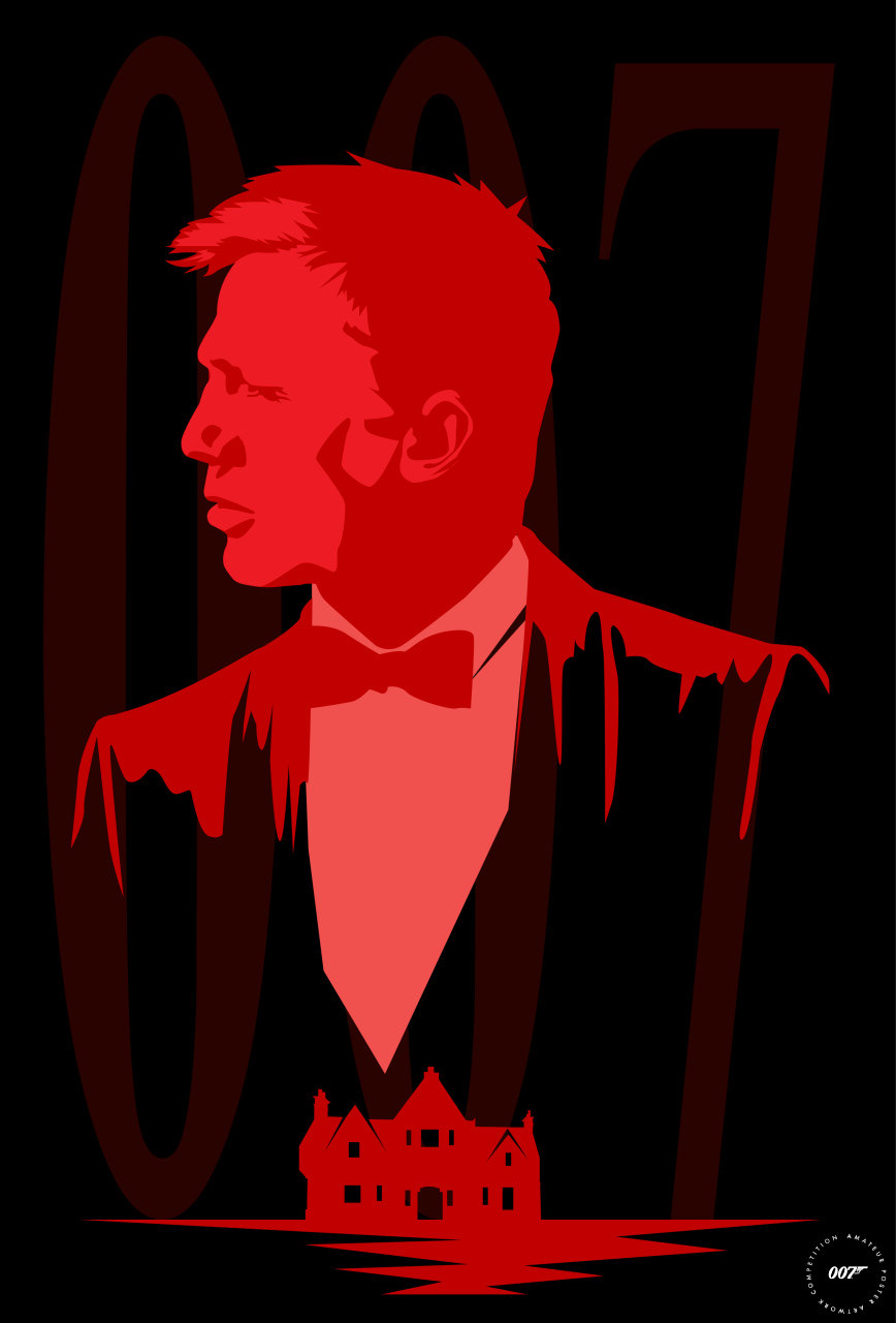
Where We Start - This design was inspired by the title sequence of Skyfall. I pulled the colors and the house from the theme. I looked at the mood board for inspiration and chose to do the 007 in the background as some of the posters did to tie back to the classic Bond film posters. In my opinion, Skyfall is one of the best James Bond films and also includes one of the best songs. The style of the film is very remarkable and is definitely an influence on me. I love the exploration of Bond’s past and how it catches up to him. It is a great adventure story that I love to re-watch whenever I can.
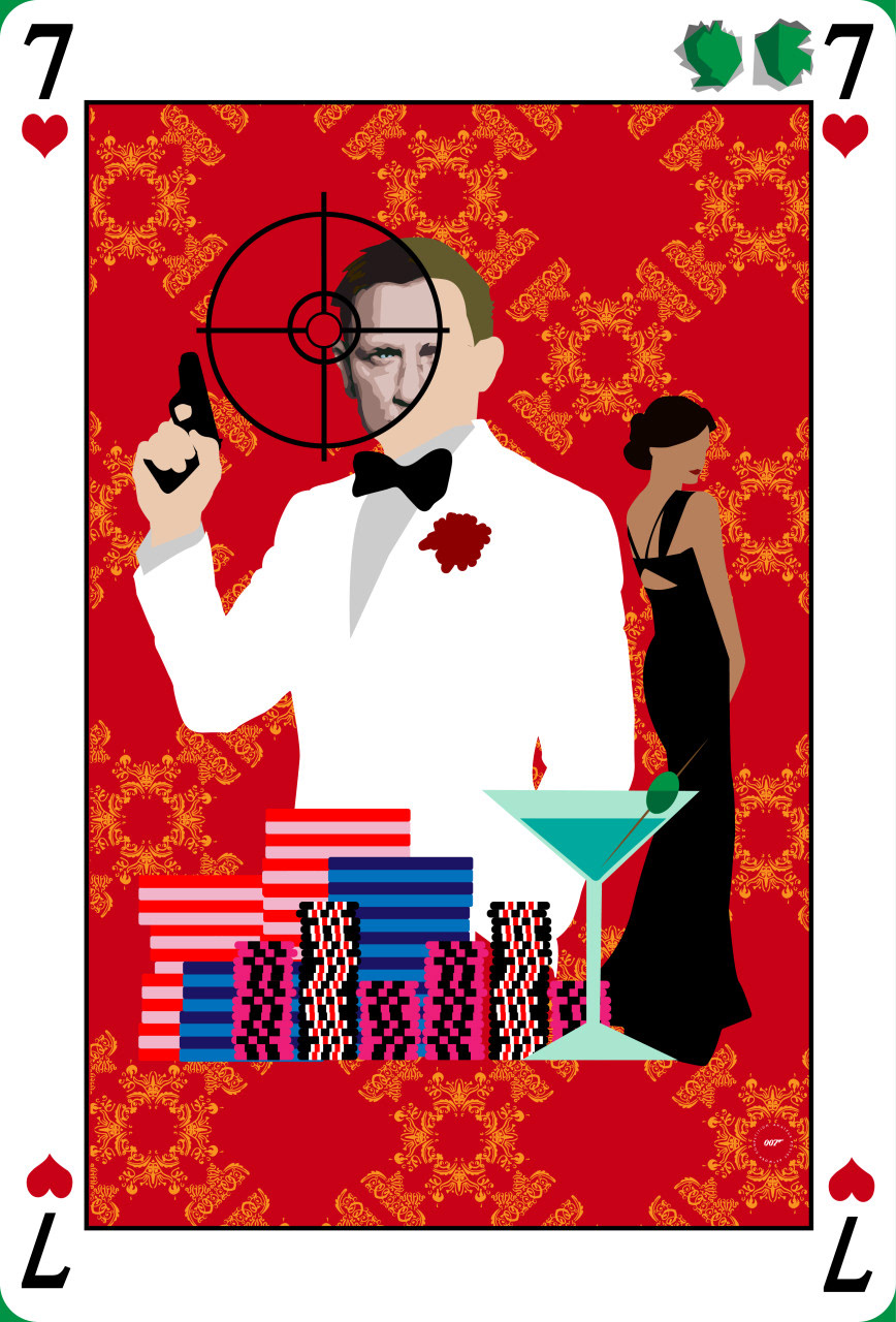
Seven of Hearts - I designed this poster to look like a playing card to tie back to the gambling theme of Casino Royale. I did a simplistic view of the characters, martini, and poker chips like the theme song. I also did the traveling target passing over Bond’s face to reveal a more detailed look at it like the theme does with Eva Green on the Queen card. I also added the card being shot to show the 007 just like the theme song as well. As I’ve said before, I really love the opening to Casino Royale. I like the Saul Bass style that is so simplistic but beautiful. The style also seems to draw back to the older films and the classic techniques that were used in their poster designs as well as their theme titles.
Dia De Los Muertos - This design was inspired by the Daniel Craig film Spectre. One of my favorite scenes is the opening of the film where the Day of the Dead festival is taking place and Bond is disguised as a skeleton. I wanted to display that skeleton costume, as well as Daniel Craig’s Bond. I used the concept of broken glass from numerous past posters to show the two faces of Bond. I enjoyed the sense of mystery throughout Spectre and I wanted to reflect that in my design. The film, as well as many of the James Bond stories, kept me on the edge of my seat. The suspense and adventure made me believe like I was part of the story. That is one of the things I love about James Bond series. I hope to capture an essence of that remarkable storytelling in my designs.